The camera I will be using during module sessions is the Nikon D7000 with a zoom lens. As someone who has shot for years exclusively with Canon, it was quite a challenge for me to get to grips with a Nikon camera - but I feel that it's really important for me to be confident using multiple camera brands.
Today's task was to walk around campus and intentionally capture images that we would define as "good" and "bad." I decided to photograph numerous subjects in different ways to define what makes good & bad composition, framing and planning.
Contact sheets:


I intentionally shot "bad" images, then re-shot the same subject with a good consideration of the framing and composition. Below are some comparisons. These are all SOOC and unedited.


Although this task was just to experiment with unfamiliar cameras, and our use of composition, I took some of my favourite images into Photoshop to edit. My editing style across the below images isn't consistent - this was more of a personal activity to see how I would improve them in post-production.
 |
| f/5.6 1/125 ISO 360 |

S-curve to create more contrast, then a 50% opacity orange filter to create a more autumnal colour palette.
 |
| f/8 1/250 ISO 200 |

Imported into Google Nik to convert to black and white, increased the "structure" to heighten detail, subtle vignette to bring attention to the three people rather than the action at the edges of the image.
 |
| f/5.6 1/125 ISO 200 |

Curves and levels adjustments, cropped to shift the subject into the left third, clone stamp tool to remove a one large distracting element in the background, double exposure effect (duplicated layer > gaussian blur > enlarged > 30% opacity) to create a warmer glow around the flower using the tone of its petals.
 |
| f/5.6 1/125 ISO 200 |

S-curve to increase contrast, duplicated layer, erased one side and flipped horizontally to create an eerily perfect symmetry. I also converted this image to black and white - I often do this with images, especially of architecture, that have a wide tonal range or interesting textures, as the absence of colour draws attention to these elements.
---
After covering Muybridge's famed image series of horse limb movements in week 1, this week's first practical task was to explore shutter speed through the practice of "jumpology."
Below are the photographs I took of a peer to demonstrate how movement can be captured in crisp detail, in a split second, as one jumps off of the ground. These images are poor in terms of composition (and I didn't estimate how high the jump would be!) but they exemplify how split moments can be preserved in order to record patterns of movement.

Movement study:


Moving on to a location at the front of campus, we explored shutter speed and movement further by capturing cars travelling across the A-road. This was quite a difficult challenge, especially shooting in manual focus on a camera I was unfamiliar with.
Using the settings f/16, 1/60 & ISO 200 I adjusted my focus to the approximate distance of where the cars would be when I pressed the shutter. I then tracked a car from when it was first visible, panning my camera along as it moved, until it was directly in front of me - where I would press the shutter. When executed perfectly this produced images where the car was in focus, but its surroundings were all distorted through motion blur - creating the impression that the vehicles were moving with speed.


As mentioned in the classroom session, it is normal to produce hundreds of images on a shoot and only have a limited number of "successful" images. Below are the best images I've chosen from my contact sheets of over 120:


---
WEEK 3 RECORDS
In this session we explored how to adjust the aperture, to produce images with a large and a shallow depth of field. The images below were achieved by adjusting the aperture setting, in full manual mode, to either 'extremes' - from f/5.6 to f/32.
When changing this setting, the shutter speed had to be compensated in order to produce evenly exposed images. As such, when shooting with f/32, the shutter speed was set to 20 seconds in order to allow enough light, as otherwise the image would be under-exposed due to the small aperture.
When discussing aperture, f/32 is referred to as a "small" aperture. It increases the depth of field. On the other end of the scale, f/5.6 or smaller is considered a "wide" aperture, and produces a shallow depth of field, meaning that either the background or foreground (or both) are 'blurred' whilst the subject(s) remain in focus.
The depth of field can also be manipulated using a zoom lens, as when a lens set to a longer focal length, zooming in on a subject, this is likely to produce a shallow depth of field.


DSC_5602: f/32, 20.0sec, ISO 100

DSC_5603: f/5.6, 0.6sec, ISO 100
---


As I stuck closely to the assignment brief settings, I did not change my shutter speed and didn't regularly check how my images were coming out. Therefore many of my images were slightly blurred or out of focus. However the above image is my favourite from the shoot; it is in perfect focus, capturing the centred subject in full detail.
Whilst in Brighton, I found myself drawn to capturing people who were walking in a rush. I shot these subjects on a continuous mode then selected the best ones to edit, based on which were the best focussed.
Whenever I am undertaking any street photography I always find myself instinctively looking for reflections, or window frames, to frame subjects or provide symmetry. The edited images below exemplify both this and my preference for black and white imagery. I often convert images to black and white whilst editing because I think this gives images a more timeless feel. I am a huge admirer of classic street photographers such as Vivian Maier - I think this is where my inspiration comes from. Black and white imagery, I feel, romanticises settings more and brings the viewer's attention to the lines and composition as there are no distracting colours.

To prepare for the presentation of my photo essay in the final submission, I created a 'draft' web gallery using images from a ten-minute photo shoot.
The shoot brief was to photograph "rubbish" on campus. After photographing around 50 images I narrowed these down using tagging in Adobe Bridge.
The web gallery was then constructed in Adobe Lightroom, from the "web" menu at the top right of the software. From here I was able to input a title, subtitle and descriptive text, as well as format the gallery's appearance. I chose to make all images visible on one page. Below is an annotated screenshot of how this practice will influence my final web gallery:
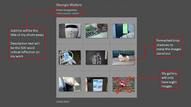
When the thumbnails are clicked on, the images will open individually. I formatted this so they appear large to fill the screen, so all detail is visible. The outcome is evident in the screenshot below. However, I need to adapt the preset I've made for my final gallery, so the viewer does not have to scroll down: the images appear so large that the bottom section is cut off.

Use of Aperture in my extra-curricular work:
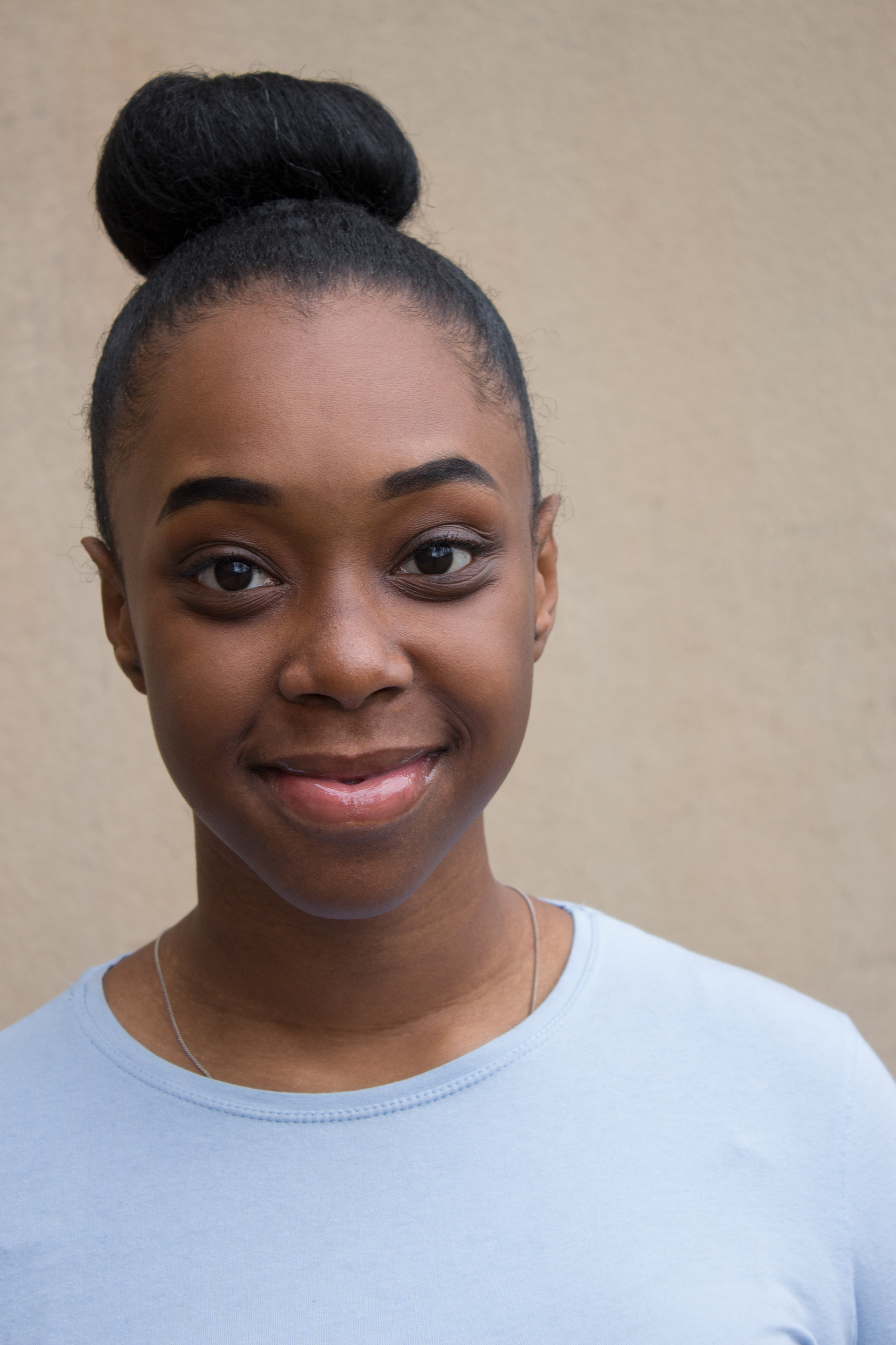
When commissioned for portrait work outside of study, I often shoot using the Aperture Priority function on my camera (an EOS 100d) in order to have the most control over the depth of field.
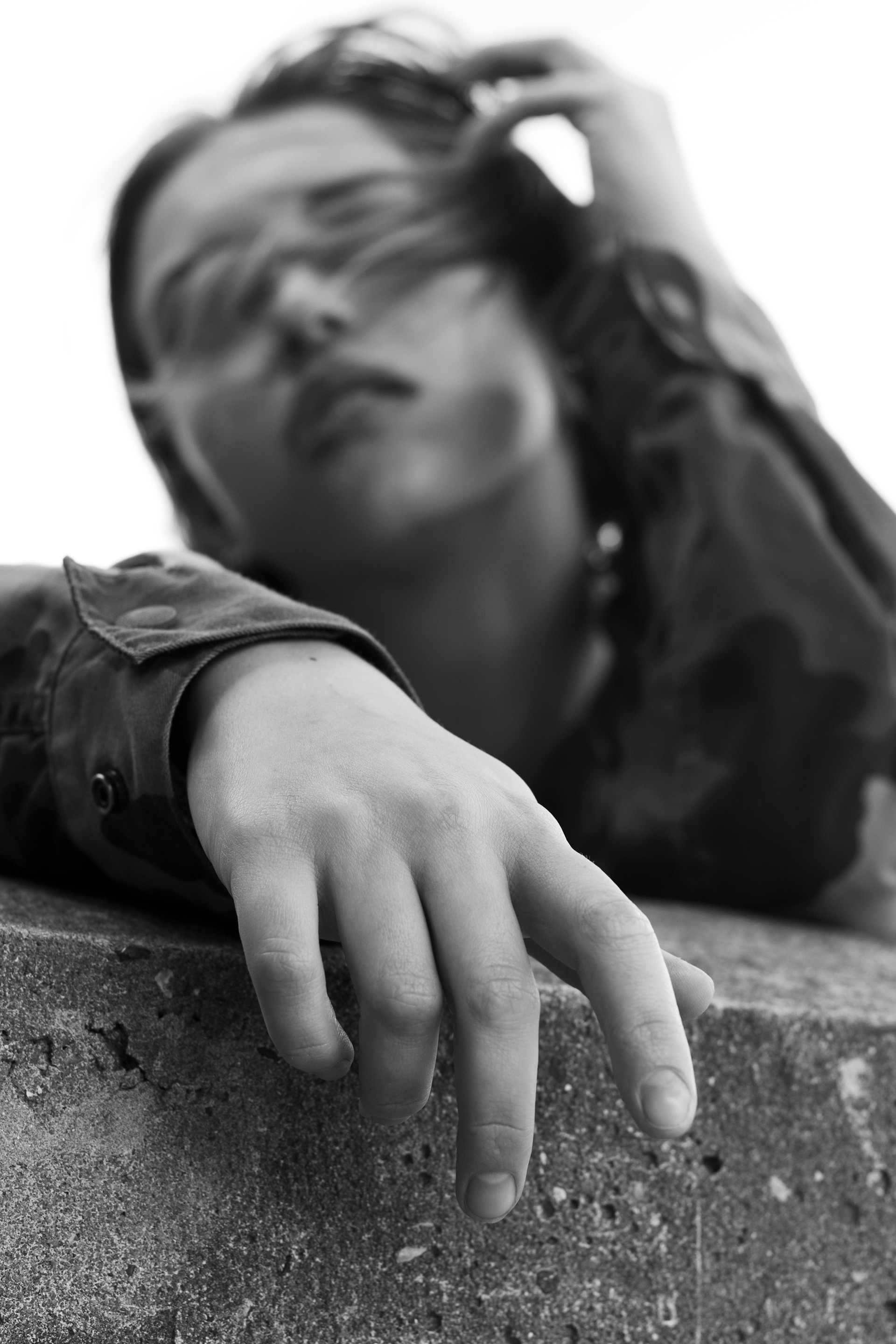
My portraiture style commonly involves shooting with a wide aperture as low as f5.6 in order to completely blur a background and ensure the viewer's main focus is on the subject. The below images are from an acting headshot session (left) and a collaborative model shoot (right).
For the formal headshot, the viewer's attention needed to be focused on the features of the actress, and I did not want the background (a textured wall) to distract focus. I therefore shot this on f/5.6, producing a shallow depth of field for conventional purposes.
The second image was from an experimental collaboration with a model over the summer. We were shooting unplanned, unconventional poses to produce more editorial-style, 'artistic' images. During our test shots, this image was captured on an automatic setting, which selected f/4 as I had incorrectly focused on the model's hand. It was an unintentional image, but ended up being one of my favourites from our shoot. The foreground is crisp while the model's face is out of focus, producing a more bizarre and unusual composition. Though it was an 'accident', it is one of my favourite images from the shoot, and exemplifies how depth of field can be used for creative purposes as well as for conventional portraits.
---
WEEK 4 RECORDS
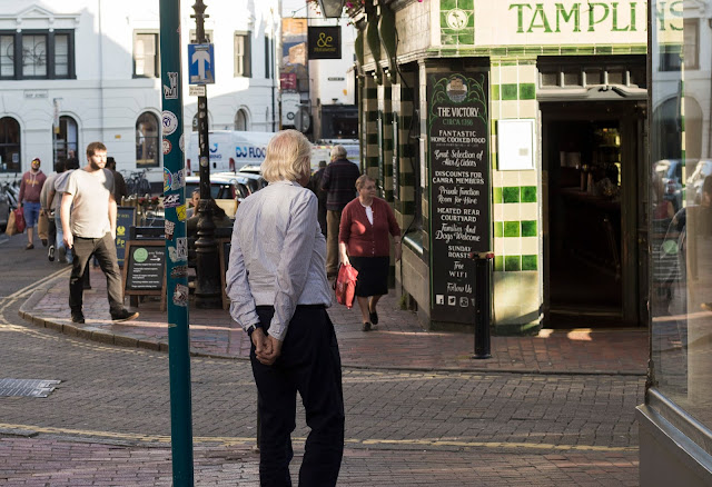
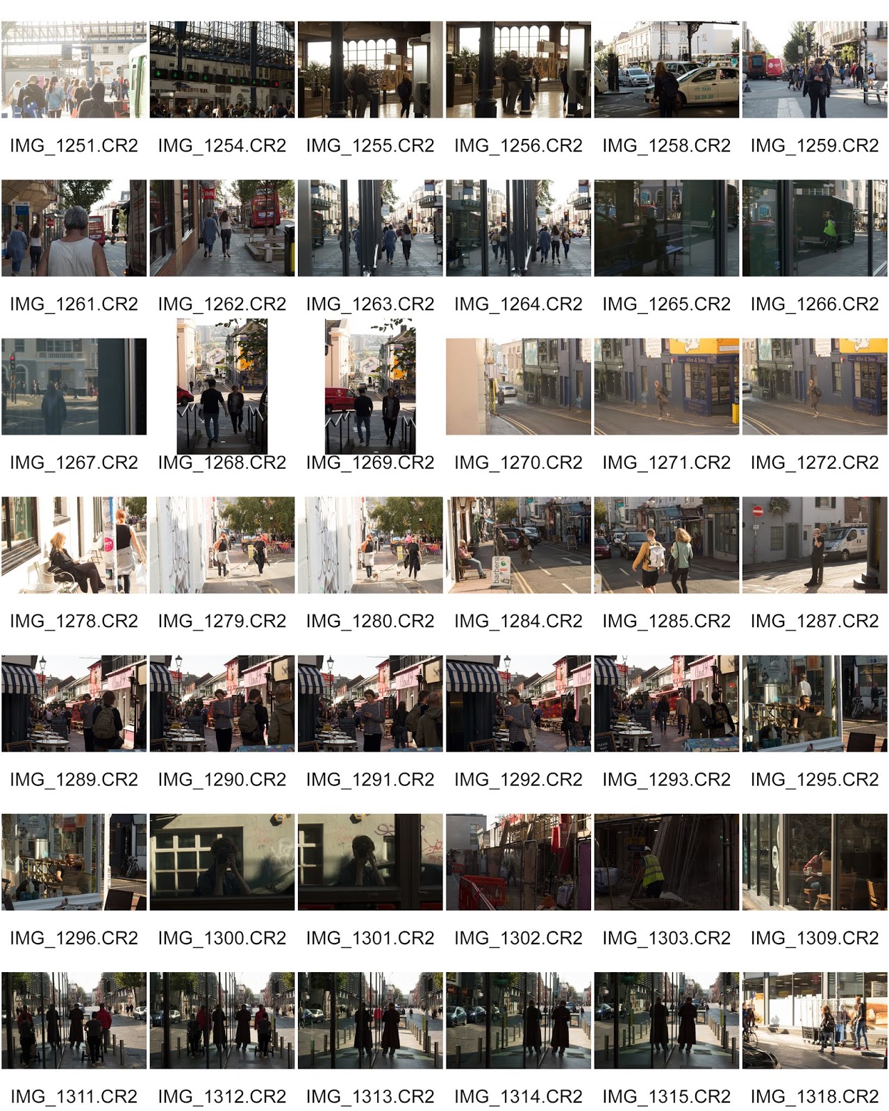
Street photography task: to capture 150 images of people along the Brighton Photo Biennial walking route.
Task evaluation:
I have done some street photography before so I felt quite confident in the nature of this task - photographing people on the street can feel daunting and awkward to some. However I do feel that I struggled somewhat with this task for two reasons.
I usually remain on an automatic setting when I am doing street photography, because I often struggle to get the settings correct to capture moments that are gone in an instant. In the assignment brief we were given guideline settings. I challenged myself by trying not to alter these settings at all - which in hindsight was an issue with varying lighting conditions.
Furthermore, I've previously done street photography on an 18-55mm lens. I completed this assignment on my 50mm lens, because I wanted to see how creative I could be with a fixed focal length. This meant I had to get closer to subjects quite often if I wanted to get the shot, and I do wish I had also used a zoom lens to crop into some scenes! As such, I don't think many of the 300 images I captured in total were successful.
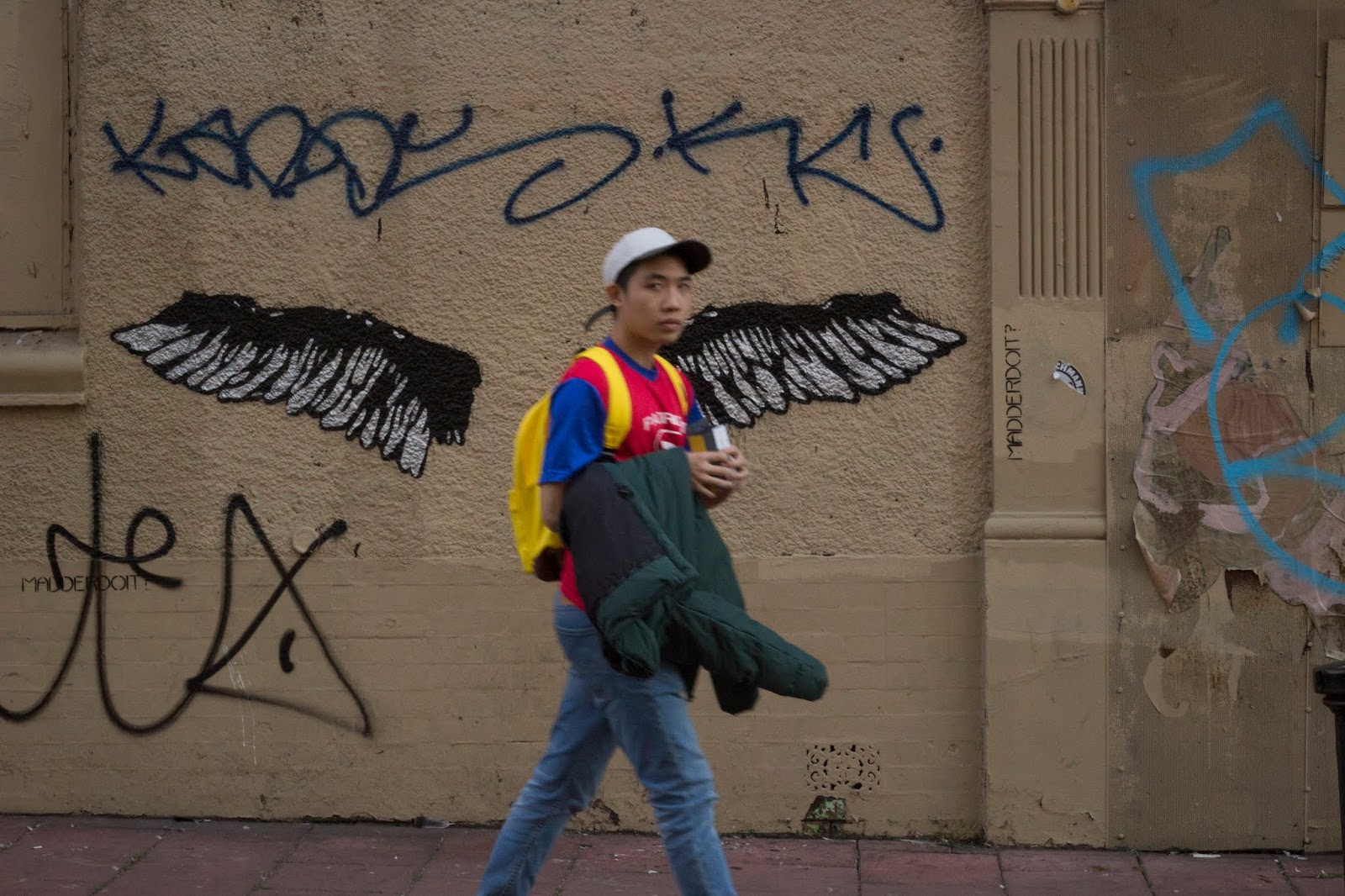
However I did capture quite a few that I was pleased with. I did not venture into Brighton with the intention of capturing any specific compositions or types of people. I really enjoyed being able to spontaneously shoot anything.
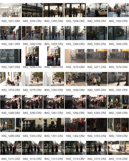
Contact sheets:


Adobe Bridge:
Adobe Bridge is a new program to me, as I am accustomed to simply scrolling through File Explorer to preview and condense my shoots.
This street photography task required a lot of condensing (As there were many unsuccessful shots) so it was a useful opportunity to explore the benefits of the program.
I imported my image folder then created keywords and sub-keywords. The first keyword was "to edit" which splits into sub-keywords of "definite" and "maybe." I tagged my images as I evaluated them, placing my favourites in the "definite" tag ones I was impartial to in the "maybe" tag. Any unsuccessful shots were tagged as "bin" so I could remove these at a later stage from my selection, without deleting the original files.
This would enable me to streamline my editing workflow. Following this task, I am able to edit my "definite" successful images. Then, if desired, I can move onto looking at the images I marked as "maybe," especially if I change my mind about my initial decisions.

Following this I was then able to condense my image preview selection to single tags. I first re-evaluated the images I tagged as "definite" to be edited. For a more meticulous detailed evaluation, I gave every image a star rating to narrow down my preferred images even further.
Typically, I edit shoots in a chronological order. However I would like to try adapting my editing workflow by star ratings to edit the definite successful images first. After I've decided on all the images I want to edit, I can then right-click on them to edit in Photoshop.

Editing Process:
I edited the images using the camera RAW editing panel in Photoshop.

Edited Images:
 |
| f11, 1/125, ISO 400 |
As I stuck closely to the assignment brief settings, I did not change my shutter speed and didn't regularly check how my images were coming out. Therefore many of my images were slightly blurred or out of focus. However the above image is my favourite from the shoot; it is in perfect focus, capturing the centred subject in full detail.
 |

 |
| f/18 1/125 ISO 400 |
 |
| f/18 1/125 ISO 400 |
 |
| f/11 1/125 ISO 800 |
 |
| f/16 1/125 ISO 800 |
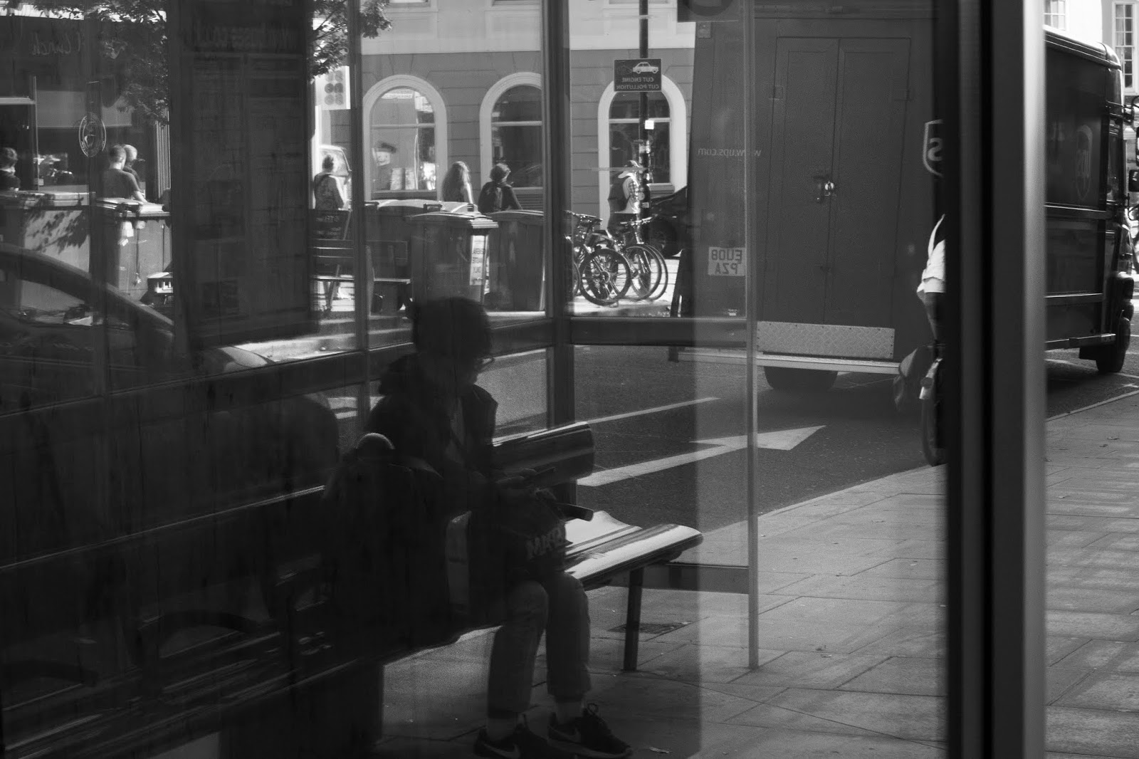
Whilst in Brighton, I found myself drawn to capturing people who were walking in a rush. I shot these subjects on a continuous mode then selected the best ones to edit, based on which were the best focussed.
Whenever I am undertaking any street photography I always find myself instinctively looking for reflections, or window frames, to frame subjects or provide symmetry. The edited images below exemplify both this and my preference for black and white imagery. I often convert images to black and white whilst editing because I think this gives images a more timeless feel. I am a huge admirer of classic street photographers such as Vivian Maier - I think this is where my inspiration comes from. Black and white imagery, I feel, romanticises settings more and brings the viewer's attention to the lines and composition as there are no distracting colours.
 |
| f/18 1/125 ISO 400 |
 |
| f/18 1/125 ISO 400 |
 |
| f/22 1/125 ISO 400 |
 |
| f/22 1/125 ISO 400 |
 |

 |
| f/20 1/125 ISO 800 |
---
WEEK 6 RECORDS
[my elevator pitch is included in my photo essay section of the portfolio]
---
WEEK 7 RECORDS
In the workshop on flash we first covered the basics of studio lighting, and how different positions and numbers of lights impact the lighting of a subject and the shadows that fall upon them.
 One light = key light
Two lights = one key + one fill light
Bouncing light onto a white wall/surface softens and diffuses light.
ON CAMERA FLASH:
On-camera flash tends to be avoided by professional photographers. It is much more limited than studio lighting, or flash guns, as the position of the flash is fixed above the lens. Images taken with on-camera flash therefore have a 'flatter' appearance, as the light is simply directed straightforwards. However, this style of flash is useful for certain occasions as it evenly distributes light. If the subject is facing the camera directly, their face should be evenly lit - but there would not be much 'depth' as this would not produce shadows.
FLASH GUN USAGE:
- flash guns are more versatile than an on-camera flash, as they can be angled e.g. the light can be directed to bounce off of a nearby wall to diffuse its intensity
- flash guns are preferable for non-studio shoots with dim location lighting such as parties / clubs
- manual mode: lower ISO of 100/200 as this provides better quality / f/4.5 / 1/200 or greater
- the +/- button changes the speed and intensity of the light: 1/1 = overexposed and 1/2 = half the intensity of the light
We experimented with flash guns in the workshop, to examine how shadows and distribution of light changes when the angle or settings are altered.


WEEK 8 RECORDS
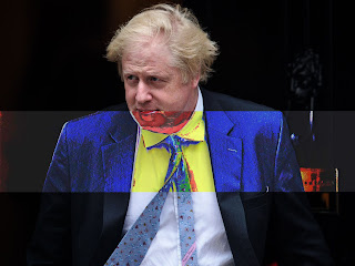
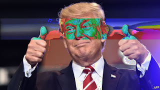
Experimenting with various ways of bending the data of image files, I decided to distort images of various political figures.
METHOD 1 - AUDACITY:
I imported the images into Photoshop, saved them as .TIFF formats, then imported this version of the file into Audacity. Audacity is a free audio editing software; it is not built for images. However, the software can be 'tricked' into opening images when they are in a .TIFF file format and imported as an audio file.


Corrupted images:


With each individual decrease of the number of pixels, the size of the image reduced. This meant that I had to zoom into the photograph to perceive the subject - but the image becomes increasingly unclear. In addition, the resampling was set to automatic to produce this effect. With each resize, I saved a new version of the image. After decreasing the pixels to two figures, I then increased to the original ratio. This blew up the shrunken image to its original size, yet its file quality was permanently destroyed.
The screenshot below depicts the last two saved resized images. It is clear that as the quality decreased, the individual pixels become visible - to the extent where the image becomes a simply mosaic of colour that vaguely resembles the original. The outcome of this project reminded me of Marco Sadano's work. The artist recreated famous paintings using LEGO bricks, creating the illusion of a pixelated image which, when viewed from afar, closely resembles the detailed paintings.

WEEK 10 RECORDS
In the workshop on flash we first covered the basics of studio lighting, and how different positions and numbers of lights impact the lighting of a subject and the shadows that fall upon them.
THREE POINT LIGHTING:

Two lights = one key + one fill light
Bouncing light onto a white wall/surface softens and diffuses light.
ON CAMERA FLASH:
On-camera flash tends to be avoided by professional photographers. It is much more limited than studio lighting, or flash guns, as the position of the flash is fixed above the lens. Images taken with on-camera flash therefore have a 'flatter' appearance, as the light is simply directed straightforwards. However, this style of flash is useful for certain occasions as it evenly distributes light. If the subject is facing the camera directly, their face should be evenly lit - but there would not be much 'depth' as this would not produce shadows.
FLASH GUN USAGE:
- flash guns are more versatile than an on-camera flash, as they can be angled e.g. the light can be directed to bounce off of a nearby wall to diffuse its intensity
- flash guns are preferable for non-studio shoots with dim location lighting such as parties / clubs
- manual mode: lower ISO of 100/200 as this provides better quality / f/4.5 / 1/200 or greater
- the +/- button changes the speed and intensity of the light: 1/1 = overexposed and 1/2 = half the intensity of the light
We experimented with flash guns in the workshop, to examine how shadows and distribution of light changes when the angle or settings are altered.

 |
| f/7.1 1/125 ISO 100 |
 |
| f/7 1/125 ISO 100 |
Left: the intensity of the light was lower, hence the slight underexposing of the image. The angle of the flash gun was also slightly off-centre, and the model had their head tilted - this led to unwanted shadows under the chin and behind his hair. I improved on the use of flash in the image on the right, where the model and flash gun are facing each other directly. This produced less visible shadow behind the model, so there isn't a strange distorted silhouette. The power of the flashgun was slightly higher too. This created brighter, even lighting across the face - but the angle of the flashgun does mean it is quite a 'flat' image. The incredibly even lighting makes the model appear almost two-dimensional.
 |
| f/7 1/125 ISO 100 |
I also photographed my peer against a black background, as the white wall didn't give such a dynamic effect. When combining the use of flash with a dark background it is easier to make the model stand out. Here the flash-gun was shot on a lower intensity and directed towards the face, which is the most well-lit. In this image we were attempting to emulate typical grime music portraits. In this genre of music photography the use of flashguns, dimly lit locations and dark backdrops is rather conventional, as evidenced by Vicky Grout's image below.
Vicky Grout - image sourced from: https://bit.ly/2roNpui
---
WEEK 8 RECORDS
Experimenting with various ways of bending the data of image files, I decided to distort images of various political figures.
METHOD 1 - AUDACITY:
I imported the images into Photoshop, saved them as .TIFF formats, then imported this version of the file into Audacity. Audacity is a free audio editing software; it is not built for images. However, the software can be 'tricked' into opening images when they are in a .TIFF file format and imported as an audio file.

This action opens the image as a a wave, illustrated above, with the data corresponding to visual elements constructing sound instead. This visual map of the data can be modified using the audio editing settings, such as the "bass and treble," "pitch" and "speed." To perform these actions I highlighted random sections of the soundwave. As, of course, it is not a depiction of the image itself, it is impossible to accurately predict how the image data is impacted. However I learned that manipulating the first sixth of the data corrupts the image altogether.

After experimenting differently on each image, I then exported the file in a .RAW format. This enables the file to be opened in Photoshop again as an image.

Corrupted images:
The more I experimented with Audacity, the easier it became to predict which sections of the soundwave corresponded to which section of the image. Through trial and error I created glitched bars across the subject faces. I intentionally chose images of politicians I dislike - so I guess that I was subconsciously constructing representations of them being corrupted under the surface.
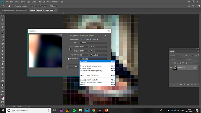
METHOD 2 - PHOTOSHOP:
The data of an image can also be modified within Photoshop through the simple act of resizing. To demonstrate this, I continually halved the number of pixels across the width and length of the below portrait.


The screenshot below depicts the last two saved resized images. It is clear that as the quality decreased, the individual pixels become visible - to the extent where the image becomes a simply mosaic of colour that vaguely resembles the original. The outcome of this project reminded me of Marco Sadano's work. The artist recreated famous paintings using LEGO bricks, creating the illusion of a pixelated image which, when viewed from afar, closely resembles the detailed paintings.

WEEK 10 RECORDS
To prepare for the presentation of my photo essay in the final submission, I created a 'draft' web gallery using images from a ten-minute photo shoot.
The shoot brief was to photograph "rubbish" on campus. After photographing around 50 images I narrowed these down using tagging in Adobe Bridge.
The web gallery was then constructed in Adobe Lightroom, from the "web" menu at the top right of the software. From here I was able to input a title, subtitle and descriptive text, as well as format the gallery's appearance. I chose to make all images visible on one page. Below is an annotated screenshot of how this practice will influence my final web gallery:

When the thumbnails are clicked on, the images will open individually. I formatted this so they appear large to fill the screen, so all detail is visible. The outcome is evident in the screenshot below. However, I need to adapt the preset I've made for my final gallery, so the viewer does not have to scroll down: the images appear so large that the bottom section is cut off.


